In 2011, SFR reviewed its strategic positioning and developed a new range of low-cost, no-commitment plans: RED by SFR was born.
In February 2016, RED by SFR launched new customizable digital offers to meet the needs of its customers, who are young, ultra-connected and budget-conscious. To accompany this new offer and to cut the umbilical cord its parent brand, RED by SFR wanted to create a new look and meet its own universe.
CBA had already helped the parent brand with its positioning and the visual identity of the SFR-Business brand, so SFR called on the agency again to help meet its new objectives.
SFR has chosed CBA to rethink the new positioning of its RED by SFR brand and to deploy a visual identity radically different from the one of the parent company to make the Pure Player unique in the eyes of its target.
To consider the design of this new positioning, the agency faced some major challenges:
- How to transform an offer into a brand?
- How to evolve from a low cost vision to a smart cost posture?
- How to cut the numbilical cord with the parent brand?
- How to switch jobs from mobile operator’s job to the Very High Speed?
- How to emerge in a telecommunication’s world saturated of messages?
- How to impact the digital native’s target, decidedly free, independent and autonomous?
"Change your perspective !"
Fundamental and smart, Red by SFR shares strong values with its consumers : independence, autonomy, daring and freedom.
Agile and responsive, it invites its consumers to exchange between themselves and with the brand in an « open source » posture.
Changes in profession, personality, positioning, target, status… To supervise this genuine revolution in the NICT brand’s universe, CBA aimed its project to a strong belief : a perspective’s radical reform !
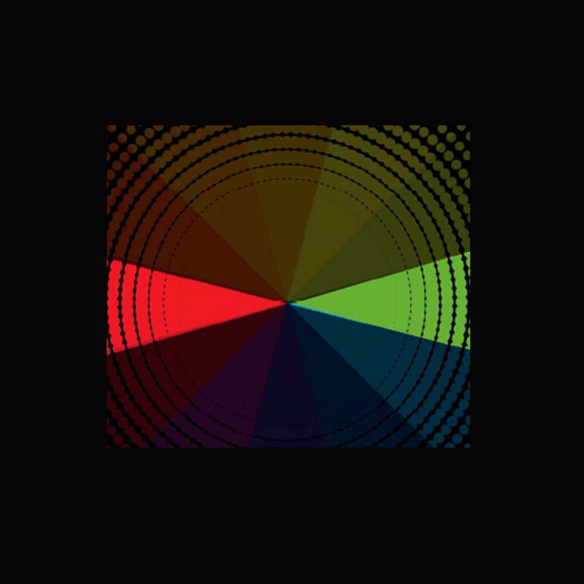
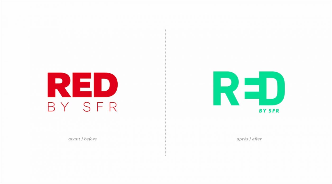
The first step of this transformation is undoubtedly the color, which has gone from SFR red to a bright, impactful green that is firmly anchored in the digital world. The choice of an unexpected color, the exact opposite of the parent company’s red on a color wheel, allows RED to become the ambassador of a new generation of consumer-actors, who do nothing like the others!
It is also a simple and fundamental logo that reminds the new brand mission (connection, link, symbollized by a plug), but also its new personality, slight and impertinent (with a smiley formed by the E + the D).
*Dare to be green!
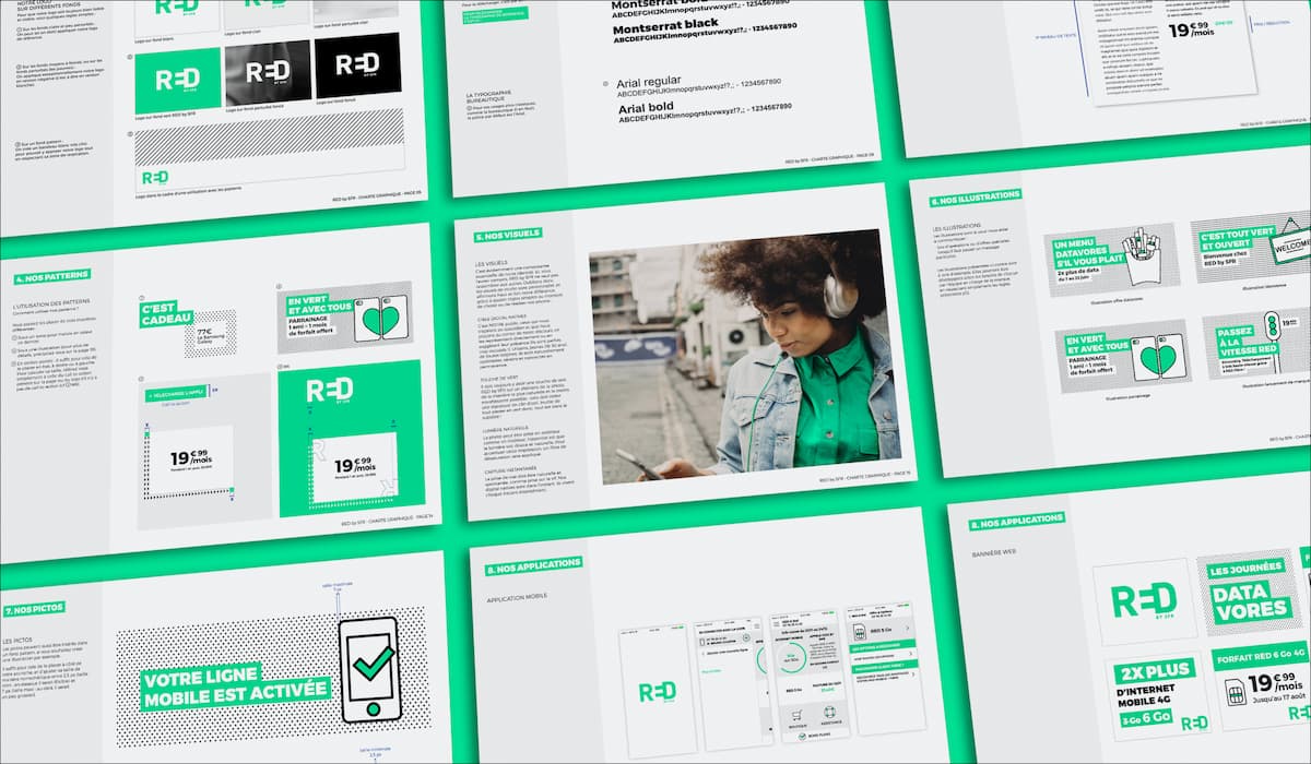
A owned and quircky universe
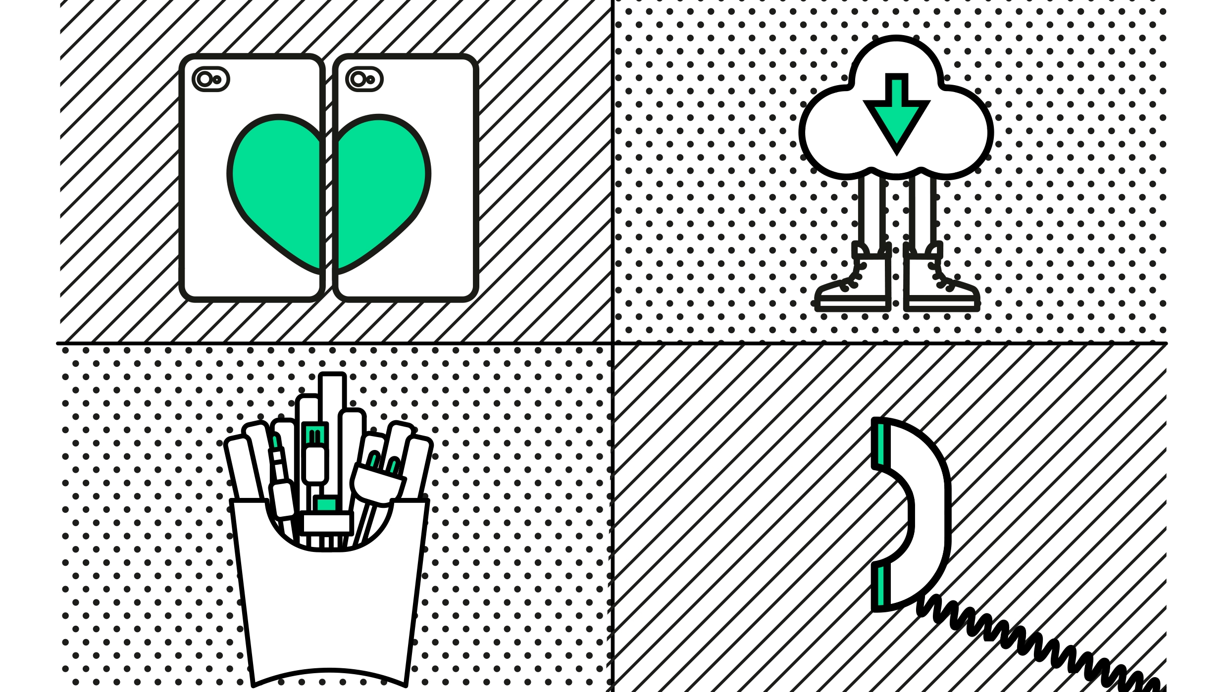
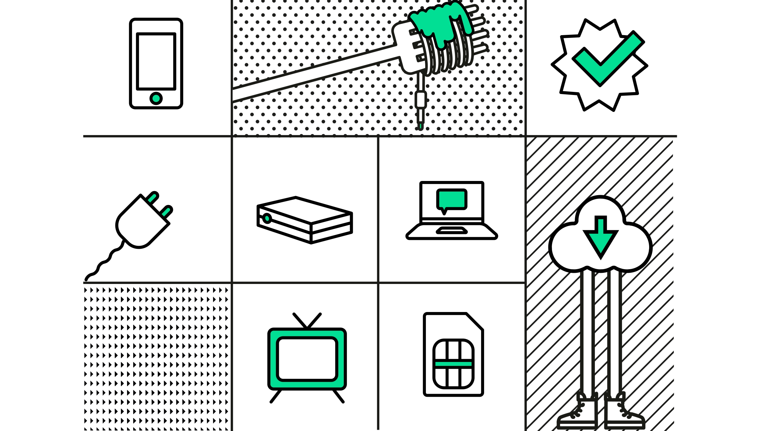
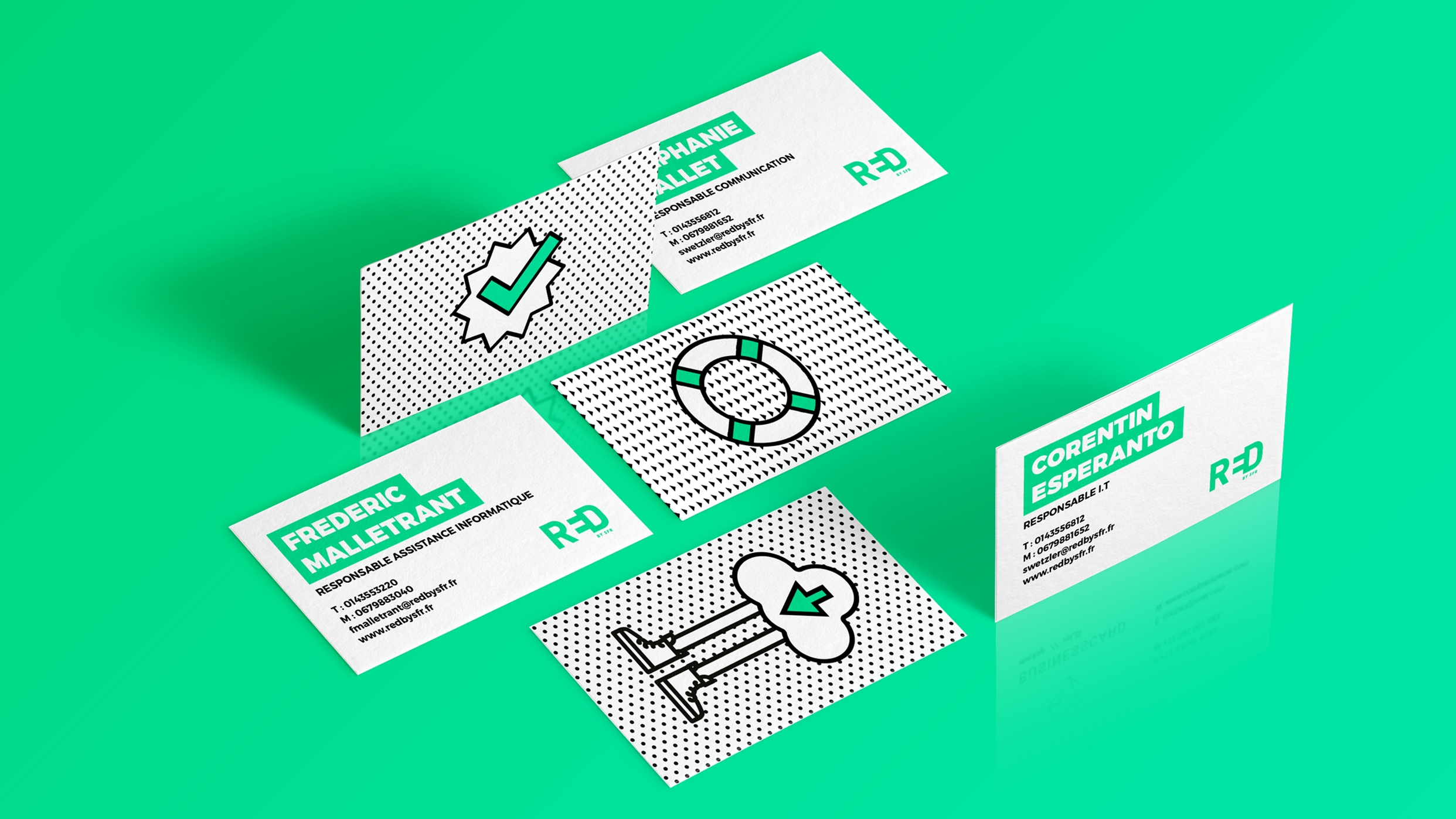
It’s a fresh and unusual graphical and semantic universe that revolves around 3 colors : the green, the white and the black. The iconography and materials are inspired by the universe of the web, in accordance with the free, direct and instantaneous posture of the new RED by SFR.
To fuel the graphic charter, CBA also imagined an iconography and material inspired by the world of the web, in keeping with the free, direct, instantaneous posture of the new RED by SFR.
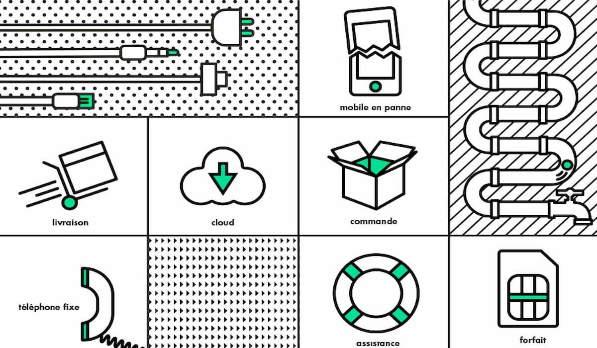
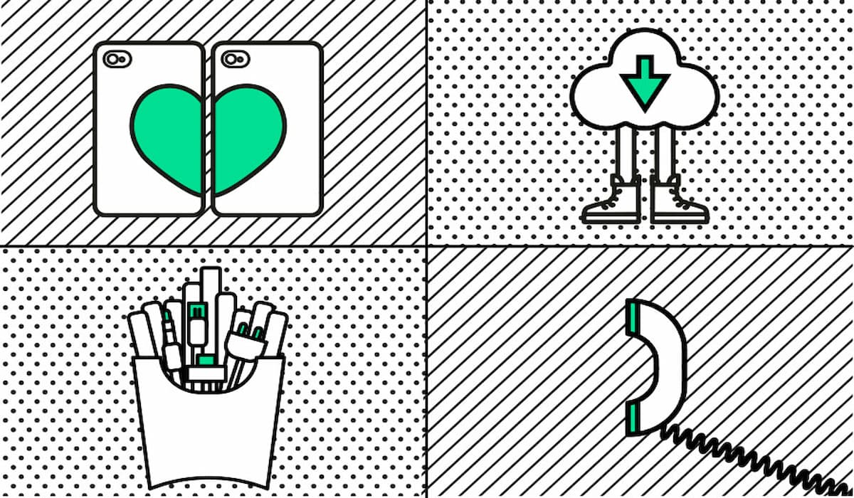
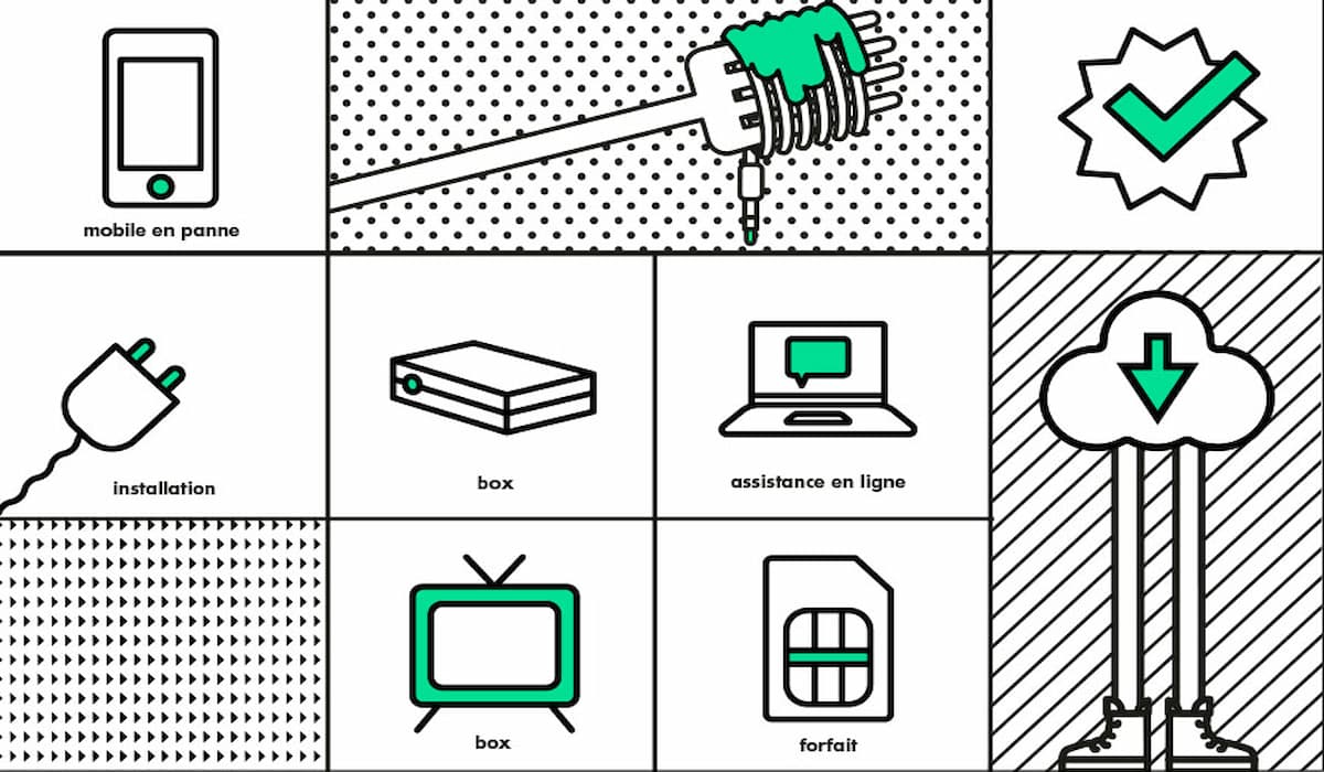
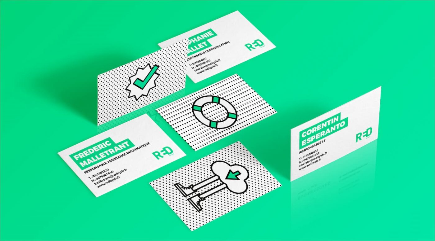
This visual identity was then adapted to RED by SFR’s own website, allowing the brand to offer a unique and personalized digital experience, adapted to digital natives.
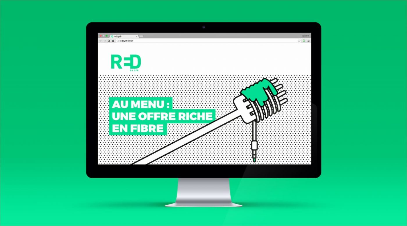
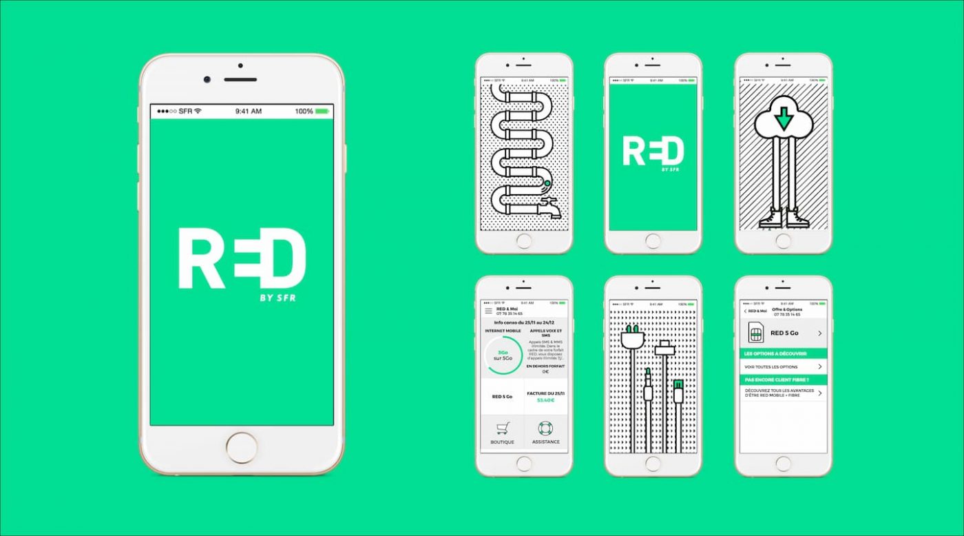
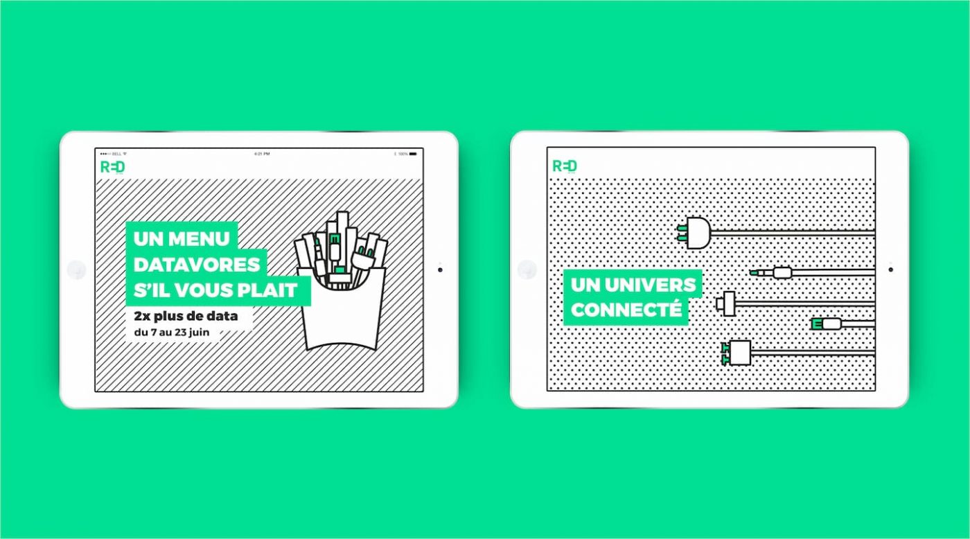
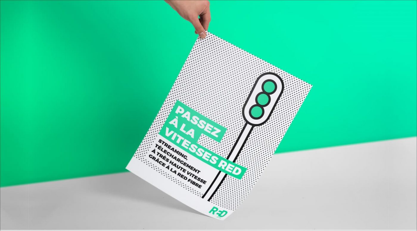
It’s a fresh and unusual graphical and semantic universe that revolves around 3 colors : the green, the white and the black. The iconography and materials are inspired by the universe of the web, in accordance with the free, direct and instantaneous posture of the new RED by SFR.
